Introducing Multiple Testing
In the plot Manhattan plot created using RStudio we were able to visually pick out the SNP that we know to be associated with the trait of interest. However, in a real GWAS we do know which SNPs are associated with the trait of interest so this is not the case. As a result, we need a way to decide if a p-value is small enough to be statistically significant and/or to warrant follow-up analysis.
Reading through some scientific articles, I have seen a wide variety of thresholds be used. These thresholds largely fall between \(5 \times 10^{-7}\) on the higher end and \(1 \times 10^{-9}\) on the lower end, which are obviously much smaller than the conventionally accepted \(0.05\) threshold. Why is this, and how can we determine which threshold to use?
Hypothesis Testing Background
Before getting into thresholds, it is important to understand the basics of hypothesis testing. The goal is to make a decision between two conflicting theories, which are labeled as the null and alternative hypothesis. In this situation, the null hypothesis \(H_0\) is that the specific SNP is not associated with the trait of interest. The alternative hypothesis \(H_A\) is that the specific SNP is associated with the trait of interest. Each SNP is tested independently for a relationship with the trait, and if the p-value resulting from the test falls below the chosen threshold then \(H_0\) can be rejected.
The example below shows a test of SNP number 830,000 in this dataset. Its p-value is \(0.41\), indicating that at the threshold of \(5 \times 10^{-7}\) we would fail to reject the null hypothesis and conclude this SNP to not be associated with our trait of interest (which we rightfully know to be true in this simulation).
# A tibble: 2 × 5
  term              estimate std.error statistic  p.value
  <chr>                <dbl>     <dbl>     <dbl>    <dbl>
1 (Intercept)         1.72       0.154    11.1   1.45e-24
2 X.clean[, 830000]  -0.0833     0.101    -0.821 4.12e- 1
Another key piece of information related to hypothesis testing is errors. Ideally, we want to reject \(H_0\) when it is wrong and accept \(H_0\) when it is right, but unfortunately this does not always happen. We call rejecting the null hypothesis \(H_0\) when it is true a type I error, and failing to reject the alternative hypothesis when it is true a type II error. For a given test, the probability of making a type I error is \(\alpha\), our chosen threshold, meaning the probability of making a type I error is in our control. Type II errors are dependent on a larger number of factors. The probability of committing a type II error is 1 minus the power of the test, where power is the probability of correctly rejecting the null hypothesis. To increase the power of a test, you can increase \(\alpha\) (though this increases type I error rate) and/or increase the sample size (here the number of people in our study).
In the context of the data, would be it better to commit a type I or type II error? In this situation, committing a type I error would mean concluding a SNP is associated with the trait of interest when in reality it is not, and committing a type II error would mean concluding a SNP is has no relationship to the trait of interest when it actually does. A harm of the type I error is investing additional time and money into studying that particular SNP and/or incorrectly giving those impacted by the disease hope that you are discovering potential causes of it. For a type II error, you are denoting SNPs associated with the trait of interest as insignificant and passing up key information that could be useful in solving a disease. The harms of both are highly unfortunate, however I would lean more on the side of minimizing the occurrence of type II errors which in turn would mean using a threshold on the slightly higher end.
Back to the threshold
As mentioned earlier, thresholds in genetic studies commonly fall between \(5 \times 10^{-7}\) and \(1 \times 10^{-9}\). Why is this?
Let’s say we are running tests for association with our trait of interest on just the 100,766 SNPs in chromosome 1 and for simplicity that the tests are independent. If we are conducting a test on just the first of those SNPs and use \(\alpha = 0.05\), the probability of making a type I error is 0.05. However, the probability of making a type I error in all 100,766 tests needed for the SNPs of the first chromosome is \[P(\text{at least 1 Type I error}) = 1 - P(\text{no error test 1}) \times... \times P(\text{no error test 100,766})\] \[ = 1 - [1-0.05]^{100,766} = \text{essentially } 1\]
With a threshold of 0.05 and independent tests, the probability of having at least one type I error (or the family-wise error rate (FWER)) for SNPs on chromosome 1 is essentially 100% as shown above. This makes it obvious that a smaller threshold is needed. If we were to use \(5 \times 10^{-7}\), this probability would fall to right around 0.05!
\[ = 1 - [1-0.0000005]^{100,766} = 0.04913\]
The threshold \(5 \times 10^{-7}\) didn’t just appear out of thin air. Statisticians came up with this threshold using what is called the Bonferroni Correction, which is a technique that gives a new significance threshold by dividing the desired family wise error rate by the number of tests conducted. Therefore, with our data if we wanted a 5% probability of a type I error across all chromosomes we would decrease the threshold to \(3.867 \times 10^{-8}\) as there are 1,651,345 polymorphic SNPs in this dataset.
\[ \text{Bonferroni threshold} = \frac{\text{FWER}}{\text{ # tests}} = \frac{0.05}{1,651,345} = 3.03 \times 10^{-8}\]
Accounting for correlation
Nearby SNPs are correlated
We just came to the conclusion that for our dataset we would use a threshold of \(3.03 \times 10^{-8}\) to determine whether or a not SNP may have a relationship with the trait of interest. However, in doing this we made one key assumption, which is that our tests are independent from one another. Unfortunately, this is certainly not the case due to linkage disequalibrium, which as stated in Science Direct is the idea that two markers in close physical proximity are correlated in a population and are in association more than would be expected with random assortment (“Linkage Disequilibrium,” n.d.). Essentially, SNPs next to each other are much more similar than SNPs far away from each other. This concept of correlated SNPs is demonstrated by the plot below, which plots the linkage disequilibrium matrix for the first 200 SNPs on chromosome 1.
chr1_200 <- SNP[1:323, 1:200]
hapmap.ld <- ld(chr1_200, depth = 199, stats = "R.squared", symmetric = TRUE)
color.pal <- natparks.pals("Acadia", 10)
image(hapmap.ld, lwd = 0, cuts = 9, col.regions = color.pal, colorkey = TRUE)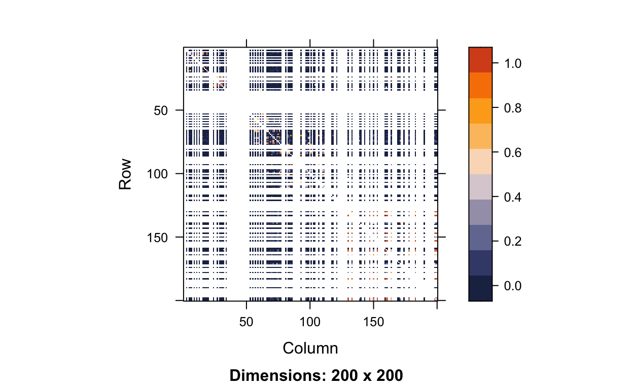
If you look closely, you can see that along the diagonal there is a higher concentration of orange, meaning that neighboring SNPs are highly correlated with one another. However, this is a little hard to see because of all the white lines. The white lines are occurring at monomorphic SNPs. If we wanted to calculate the correlation between two SNPs (X and Y) we would use the following equation:
\[r = \frac{\sum_{i=1}^n(x_i - \bar{x})(y_i - \bar{y})}{\sqrt{\sum_{i=1}^n(x_i - \bar{x})^2 \sum_{i=1}^n(y_i - \bar{y})^2}}\]
If we consider SNP X to be monomorphic, that means there are 0 copies of the minor allele for all people in our dataset. In the equation above, that means \(x_1 = ... = x_{323} = 0\). This means the sample average \(\bar{x}\) is also 0 and thus \(x_i - \bar{x} = 0 - 0 = 0\) for individuals \(i = 1, \dots, 323\). Plugging this information in, we get an undefined correlation, which is what all the white lines represent.
\[r = \frac{\sum_{i=1}^{323} 0 \times (y_i - \bar{y})}{\sqrt{0 \times \sum_{i=1}^{323}(y_i - \bar{y})^2}} = \frac{0}{0}\]
Removing the monomorphic SNPs from our LD matrix gets rid of over 120 monomorphic SNPs and better shows how highly correlated nearby SNPs are.
#get monomorphic SNPs only
maf_chr1_200 <- col.summary(chr1_200)$MAF
mono <- which(maf_chr1_200 == 0)

# calculate LD on polymorphic SNPs only
hapmap.ld.nomono <- ld(chr1_200[,-mono], depth = 199-length(mono), stats = "R.squared", symmetric = TRUE)

# plot
image(hapmap.ld.nomono, lwd = 0, cuts = 9, col.regions = color.pal, colorkey = TRUE)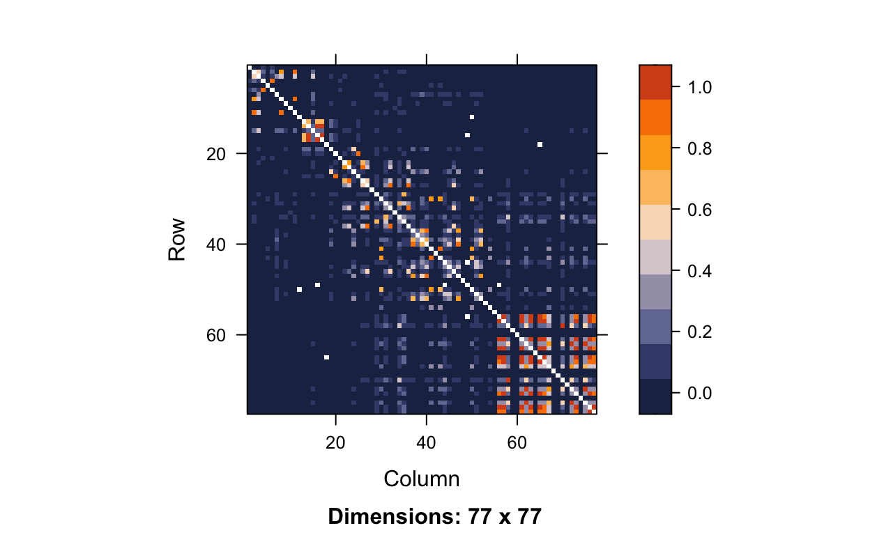
Getting a threshold with simulation
To see how the correlation impacts our threshold for a given FWER, we can use simulation. The process for simulation goes as follows:
- Simulate a null trait, meaning a trait not associated with any of the SNPs.
- Run GWAS to test the association between the simulated null trait and each SNP in our dataset. After that record the smallest p-value from this GWAS.
- Repeat steps 1 and 2 many times, typically 1,000-10,000 times in professional genetic studies.
- Look at the p-values saved from those simulation replicates. Sort them from smallest to largest and find the number at which 5% (desired FWER) of p-values are smaller than that number. This is the significance threshold.
This process is very computationally expensive, especially when 10,000 replications are completed. Each dataset has a different level of correlation between SNPs which is why there is no one widely accepted threshold for a given number of SNPs. Running 1,000 replications on Macalester’s computer takes about 29 minutes per replication, or just over 20 days total. Thus, 10,000 replications would take close to 7 months, which is clearly not computationally efficient. As a result, researchers will send code to remote computers or complete their multiple testing process in a more efficient software such as PLINK. The code below shows how we would run the the simulation in RStudio 1000 times for the entire dataset, but I will not actually run it. If I did run this code, one way I could minimize computational time slightly would be to use the mclapply() function from the parallel package. This allows computation to be split across the two cores of my computer. If your computer has more cores, this could potentially help speed up computation by a factor of the number of cores your computer has (e.g. 8x faster if you have 8 cores).
# make genotype matrix into form of 0, 1, and 2s
snp <- as(SNP, "numeric")
dim(snp)

# calculate MAF
maf <- col.summary(SNP)$MAF

# find monomorphic SNPs
monomorphic <- which(maf == 0)

# filter genotype matrix to remove monomorphic SNPs
snp <- snp[,-monomorphic]

# check the dimensions after filtering
dim(snp)

do_one_sim<- function(i){

  # simulate null trait
  y <- rnorm(n = 323, mean = 0, sd = 1)

  # implement GWAS
  pvals <- c()
  for(i in 1:1,651,345){
    mod <- lm(y ~ snp[,i])
    pvals[i] <- tidy(mod)$p.value[2]
  }
  # record smallest p-value
  min(pvals)
}

# Run code with mclapply()
set.seed(494)
simresmclapply <- mclapply(1:1000, do_one_sim, mc.cores = 2)

#will print quantile
quantile(simresmclapply %>% as.data.frame(), 0.05)
Using PLINK for Multiple Hypothesis Testing
Since the multiple testing process is so computationally expensive in RStudio, I ran it in PLINK. Running 1,000 replications on this entire dataset took only about 20 minutes in PLINK versus 20 days in RStudio, which is obviously a huge reduction in computational time (1440x faster).
To do multiple testing in PLINK, complete the following steps:
- Load the data into R.
load("rbloggersData/conversionTable.RData")

pathM <- paste("rbloggersData/108Malay_2527458snps", c(".bed", ".bim", ".fam"), sep = "")
SNP_M <- read.plink(pathM[1], pathM[2], pathM[3])

pathI <- paste("rbloggersData/105Indian_2527458snps", c(".bed", ".bim", ".fam"), sep = "")
SNP_I <- read.plink(pathI[1], pathI[2], pathI[3])

pathC <- paste("rbloggersData/110Chinese_2527458snps", c(".bed", ".bim", ".fam"), sep = "")
SNP_C <- read.plink(pathC[1], pathC[2], pathC[3])

rbloggers_fam <- rbind(SNP_M$fam, SNP_I$fam, SNP_C$fam)
rbloggers_map <- rbind(SNP_M$map, SNP_I$map, SNP_C$map)- If you didn’t run the GWAS in PLINK earlier, you will need to merge the 9 files (the .bim, .bam, and .fam for each of the 3 sub-populations). I listed the name of each of these files in .txt file with the structure shown in the image below.

In PLINK, then run the command ./plink --merge-list allfiles.txt --make-bed --out rbloggersComb. This combines the data into three files that PLINK can use (rbloggersComb.bed, rbloggersComb.bim, rbloggersComb.fam).
- Create the function
create_quantitative_trait()that creates a null trait. Then, bind the 1000 trait columns to thepedigreeandmembercolumns from therbloggers_famtable. Write this file to the folder where the data andallfiles.txtfile is stored.
create_quantitative_trait <- function(i){
  y <- rnorm(n = 323, mean = 0, sd = 1)
}

traits <- as.data.frame(replicate(1000, create_quantitative_trait()))

rbloggers_Poptraits <- cbind(rbloggers_fam %>%
        dplyr::select(1:2), traits)

write_delim(rbloggers_Poptraits, "rbloggersSep/rbloggers_Poptraits")- In PLINK, run the command
./plink --bfile rbloggersComb --assoc --pheno rbloggers_Poptraits --all-pheno --pfilter 1e-3
This will essentially run a GWAS 1000 times and it will take all p-values from those tests that are less than 1e-3. We will not end up needing all 1.65 million p-values that come with each association test (we just need the smallest one) so this lowers the computational burden on the computer.
- Once PLINK finishes this command (somewhere between 15-25 minutes), read all the files into R using the following code. This should take only a couple minutes.
- Run the code below. This will take the smallest p-value from each of the 1000 genetic-wide association studies, and then take the 5% quantile those 1000 smallest p-values. This represents the threshold you should use when running a GWAS on your real data with an actual trait of interest.
Due to storage space on my computer, I deleted all the 1000 files before creating this website so the threshold doesn’t print out above, but it was \(5.424 \times 10^{-8}\)! If you remember from above, the Bonferroni corrected threshold was \(3.03 \times 10^{-8}\). Due to tests being correlated, we are effectively conducting fewer tests which results in the simulated threshold being higher than the Bonferroni corrected threshold which treats the tests independently. The Bonferroni correction is essentially slightly too conservative - it suggests a significance threshold that is smaller than we truly need it to be. As a result, we get more type II errors and lower power. As I mentioned earlier, the harm of type II errors is that they conclude a SNP is has no relationship to the trait of interest when in reality it does, causing researchers to potentially miss out on key information in helping solve a disease. Thus, if you have time to determine a threshold using simulation instead of Bonferroni, I recommend doing so.