On the home page, I introduced genetic variants. We can study these genetic variants with something known as a Genome-Wide Association Study (GWAS). The overarching goal of a GWAS is to help us understand which SNPs might be causally associated with our trait of interest, which can be particularly important and helpful when trying to find a cure for a disease or understand why certain people get that disease.
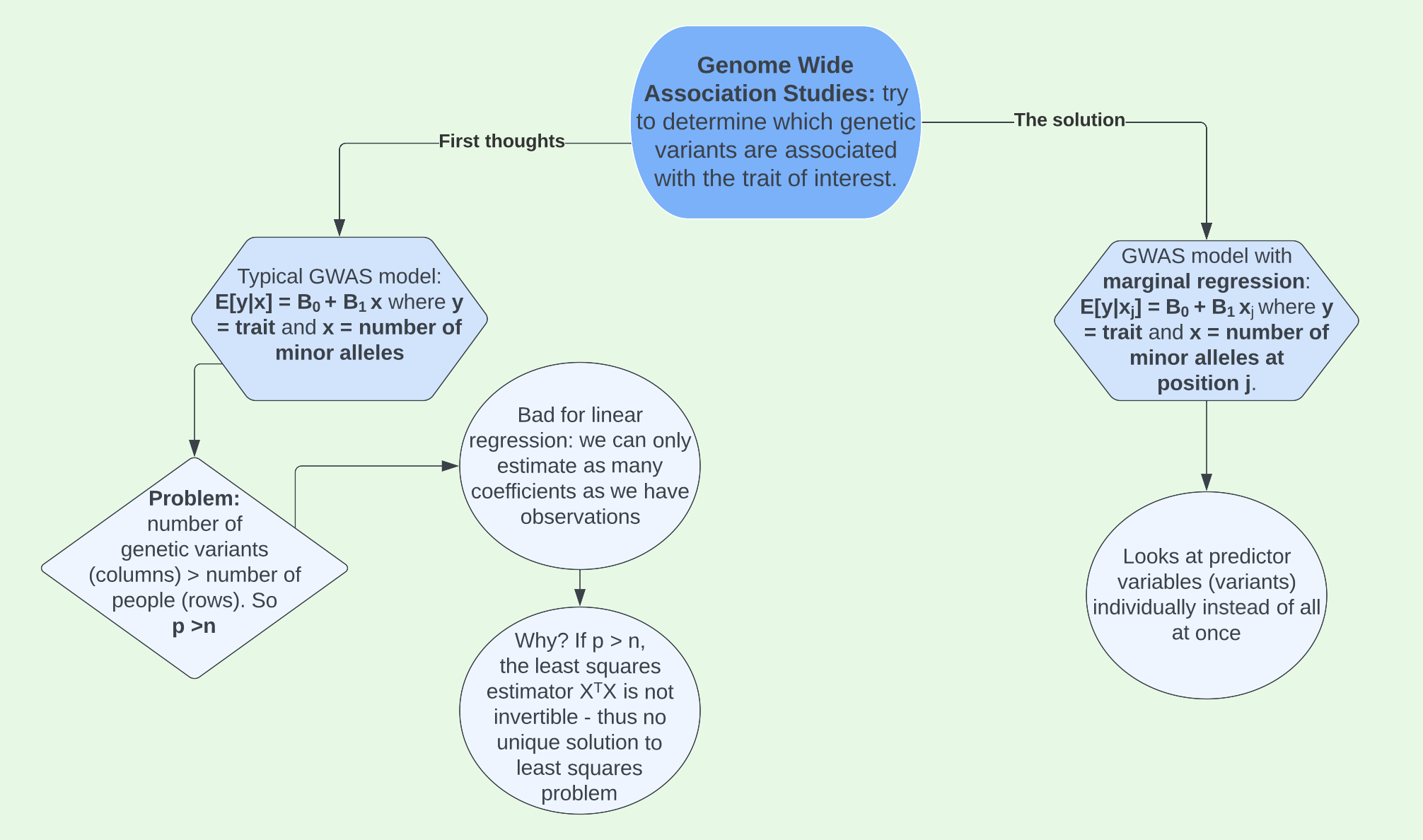
Using the trait we developed in the Data tab, we can implement marginal regression to run GWAS on our data. If you haven’t yet looked through the Data section, it would be useful to do so now in order to understand the context of this GWAS.
GWAS in RStudio
We developed our trait of interest around causal SNP, rs3131972, which we know to be located on chromosome 1. However, in a real genetic study we would not know where the casual SNP(s) we are looking for are located. Therefore, we’d need to run a GWAS to see if there are variants are associated with the trait of interest and if so, where. To do this we will use marginal regression.
For each SNP, we will fit a model with the SNP as the single independent variable and the trait of interest as the dependent variable. Looking at our first three SNPs, the models can be created like this:
snp1mod <- lm(y ~ X.clean[,1])
snp2mod <- lm(y ~ X.clean[,2])
snp3mod <- lm(y ~ X.clean[,3])

tidy(snp1mod)
# A tibble: 2 × 5
term estimate std.error statistic p.value
<chr> <dbl> <dbl> <dbl> <dbl>
1 (Intercept) -0.0869 0.308 -0.282 0.778
2 X.clean[, 1] 1.00 0.172 5.82 0.0000000144Each of these models produces an estimate for the coefficient on the SNP. For example, the coefficient for snp1mod is 1.00. The way we might interpret this is that for every additional minor allele (G for example) that you carry at that position, the trait of interest changes by about 1.00 units. If the trait we were measuring was height, we would expect your height to increase about 1.00 inches for every additional minor allele (a value of either 0, 1, or 2) at SNP 1. This is obviously pretty extreme, but you understand the idea.
Analyze chromosome 1
Obviously, we cannot do the process above by hand for over one million SNPs. However, we can do this with a loop! We will start first with all SNPs located on chromosome 1.
First, pick out these SNPs using which().
Next, loop through each of the SNPs, fitting a linear regression model at each one. For each model, we’ll record the estimates (betas), standard errors (ses), test statistics (tstats) and p-values (pvals) for the coefficient of interest, which is the slope.
# set up empty vectors for storing the results
betas <- c()
ses <- c()
tstats <- c()
pvals <- c()

# loop through SNPs in chromosme 1
for(i in chromosome1.snps){
  # fit model
  mod <- lm(y ~ X.clean[,i])
  # get coefficient information
  coefinfo <- tidy(mod)
  # record estimate, SE, test stat, and p-value
  betas[i] <- coefinfo$estimate[2]
  ses[i] <- coefinfo$std.error[2]
  tstats[i] <- coefinfo$statistic[2]
  pvals[i] <- coefinfo$p.value[2]
}
After completing the loop, we add our results to our map data frame that contains information about each SNP:
# start with the map info for the chr 1 SNPs
chr1.results <- map.clean %>%
  filter(chromosome == 1)

# then add betas, SEs, etc.
chr1.results <- chr1.results %>%
  mutate(Estimate = betas,
         Std.Error = ses,
         Test.Statistic = tstats,
         P.Value = pvals)

# look at results
head(chr1.results)
chromosome snp.name cM position allele.1 allele.2
rs3094315 1 rs3094315 NA 752566 G A
rs3131972 1 rs3131972 NA 752721 A G
exm2268640 1 exm2268640 NA 762320 T C
kgp3709449 1 kgp3709449 NA 771967 A G
kgp15275285 1 kgp15275285 NA 774047 A G
kgp5225889 1 kgp5225889 NA 779322 G A
MAF Estimate Std.Error Test.Statistic
rs3094315 0.13931889 0.9782628 0.1686493 5.800573
rs3131972 0.23374613 0.9983550 0.1448057 6.894448
exm2268640 0.09627329 0.5434766 0.2178257 2.495007
kgp3709449 0.11490683 0.8697466 0.1810295 4.804448
kgp15275285 0.14241486 -0.2383669 0.1599812 -1.489968
kgp5225889 0.12229102 0.8810804 0.1769315 4.979782
P.Value
rs3094315 1.583433e-08
rs3131972 2.877123e-11
exm2268640 1.309910e-02
kgp3709449 2.389118e-06
kgp15275285 1.372146e-01
kgp5225889 1.041390e-06chr1.results %>%
filter(snp.name == 'rs3131972') chromosome snp.name cM position allele.1 allele.2
rs3131972 1 rs3131972 NA 752721 A G
MAF Estimate Std.Error Test.Statistic P.Value
rs3131972 0.2337461 0.998355 0.1448057 6.894448 2.877123e-11Lastly, we can plot the results. We take the log of the p-value in order to better identify SNPs with small p-values, and then take the negative of this to flip the plot and make it look like the typical Manhattan plot. We see a gap in the middle of the plot where the centromere of chromosome 1 is located. Centromeres are difficult to genotype so we don’t get any data in this area. The causal SNP is easy to spot colored in navy blue with a \(-\text{log}_{10}\)(p-value) close to 12.
chr1.results %>%
  mutate(minuslogp = -log10(P.Value),
         causalSNP = as.factor(case_when(snp.name == "rs3131972" ~ 1,
                               TRUE ~ 0))) %>%
  ggplot(aes(x = position, y = minuslogp, color = causalSNP)) +
  geom_point() +
  scale_color_manual(values = c("goldenrod", "navy"))+
  labs(x = 'position (bp)', y = expression(paste('-log'[10],'(p-value)'))) +
  scale_x_continuous(labels = scales::comma)+
  theme_classic()+
  theme(legend.position = "none")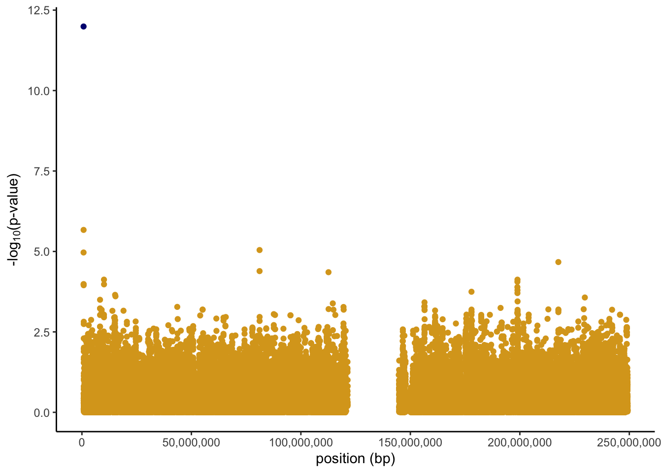
Analyze all chromosomes
Finally, we can analyze all chromosomes. To do this, we simply loop over the SNPs in all chromosomes instead of just those in chromosome 1. The problem with this code is that on my personal computer it takes over an hour to run and even on faster Macalester computers it takes close to 30 minutes. As a result, I will not actually run it here and instead talk about a solution to this problem later on.
# set up empty vectors for storing results
betas <- c()
ses <- c()
tstats <- c()
pvals <- c()

# loop through all SNPs
for(i in 1:ncol(X.clean)){
  # fit model
  mod <- lm(y ~ X.clean[,i])
  # get coefficient information
  coefinfo <- tidy(mod)
  # record estimate, SE, test stat, and p-value
  betas[i] <- coefinfo$estimate[2]
  ses[i] <- coefinfo$std.error[2]
  tstats[i] <- coefinfo$statistic[2]
  pvals[i] <- coefinfo$p.value[2]
}
# start with the map info
all.results <- map.clean
# then add betas, SEs, etc.
all.results <- all.results %>%
mutate(Estimate = betas,
Std.Error = ses,
Test.Statistic = tstats,
P.Value = pvals)Had we ran the code above, we could plot the results in a similar matter as we did for chromosome one, just making one small change to the code. Instead of plotting position along the x axis, we group with an interaction between position and chromosome. This is due to position restarting over again at each chromosome, so it prevents all the points from being plotted on top of one another. The final manhattan plot would then look something like the image below.
all.results %>%
  mutate(minuslogp = -log10(P.Value),
         chr = as.factor(chromosome)) %>%
  ggplot(aes(x = chr, y = minuslogp, group = interaction(chr, position), color = chr)) +
  geom_point(position = position_dodge(0.8)) +
  scale_color_manual(values=natparks.pals("DeathValley",22))+
  labs(x = 'chromosome', y = expression(paste('-log'[10],'(p-value)')))+
  theme_classic()+
  theme(legend.position = "none")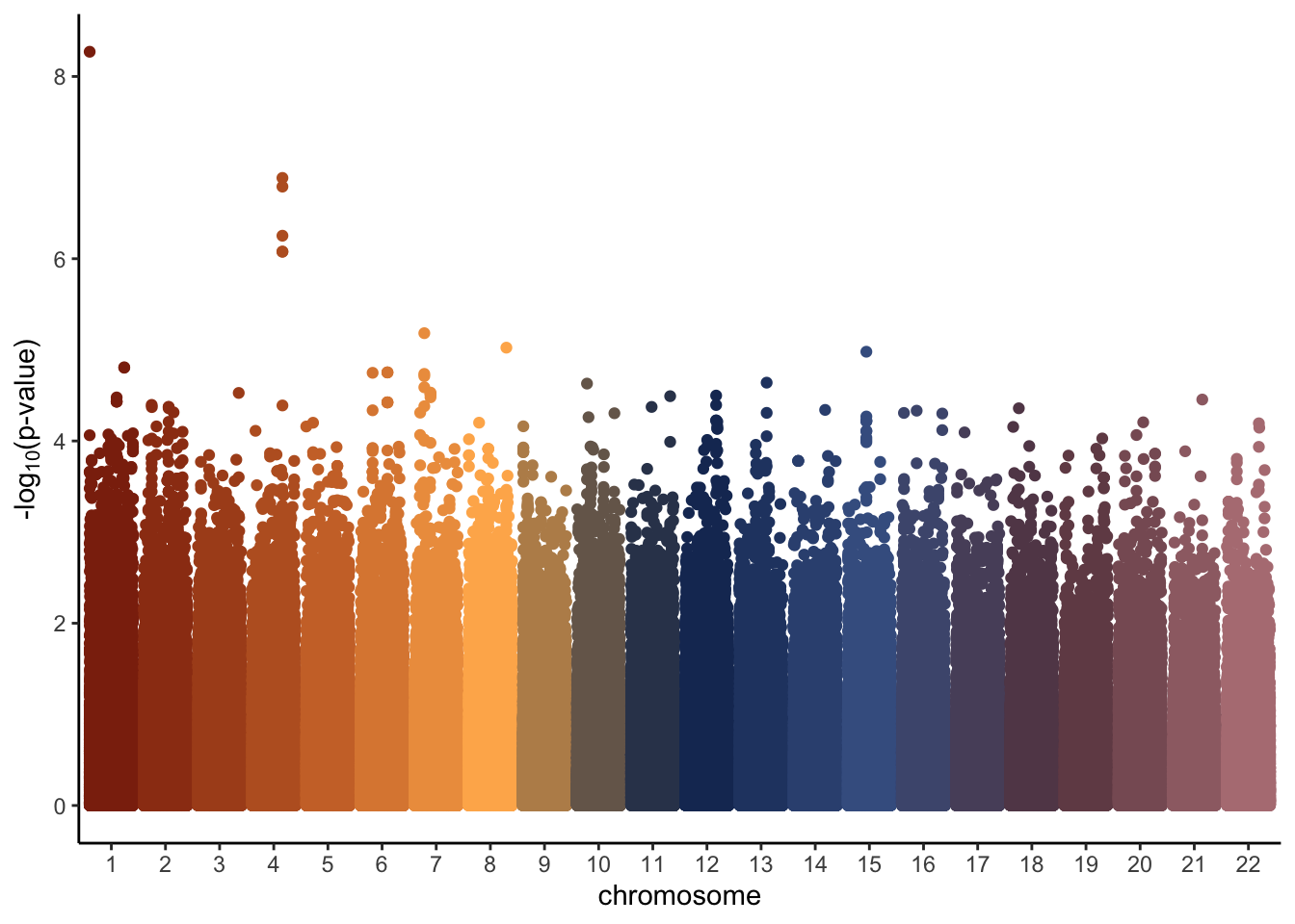
GWAS in PLINK
While the code above is fairly simple, it is not efficient. This is where the software PLINK can help. PLINK is a free, open-source whole genome association analysis toolset, designed to perform a range of basic, large-scale analyses in a computationally efficient manner. To learn more about PLINK and how to download and use it, check out this site (“Whole Genome Association Analysis Toolset,” n.d.), which I relied heavily on. Once downloaded onto your computer, PLINK runs from the terminal. We can run a GWAS in PLINK in a matter of a couple seconds instead of 30-60 minutes.
For the purposes of demonstrating PLINK, I simulated a trait not associated with any particular SNP, but that is associated with population structure. This will show us how a Manhattan plot with no associated SNPs compares to the one above, where we know a causal SNP exists. Creating a trait associated with the population structure will also be useful for analysis later in the PCA section.
To get the data ready to run in PLINK, I started by merging all 9 files (the .bim, .bam, and .fam for each of the 3 sub-populations). I listed the name of each of these files in .txt file with the structure shown in the image below.

In the terminal and in the folder where my data was stored, I then ran the command ./plink --merge-list allfiles.txt --make-bed --out rbloggersComb. This combines the data into three files that PLINK can use (rbloggersComb.bed, rbloggersComb.bim, rbloggersComb.fam).
My next step was to create a trait in RStudio. To do this, I loaded in the data in the same way that I did in the Data section, only this time adding a couple additional lines to extract information about each individual and SNP information.
I then selected the pedigree and member columns from the rbloggers_fam table and column-binded on a trait that varies by population. I wrote this new dataset (which has one row for each of the 323 study participants) to the folder where the data is stored.
set.seed(494)
rbloggers_poptrait <- cbind(rbloggers_fam %>% select(1:2),
                            trait = c(rnorm(n = 108, mean = 0, sd = 1), rnorm(105, -1, sd = 1), rnorm(110, 1, 1)))

head(rbloggers_poptrait)
pedigree member trait
M11062205 M11062205 M11062205 -1.7917316
M11050406 M11050406 M11050406 -0.3732191
M11050407 M11050407 M11050407 -0.6577352
M11070602 M11070602 M11070602 -0.8303604
M11060912 M11060912 M11060912 1.9450827
M11060920 M11060920 M11060920 0.8350451write_delim(rbloggers_poptrait, "rbloggersSep/rbloggers_poptrait")In PLINK, I then ran the command ./plink --bfile rbloggersComb --assoc --adjust --pheno rbloggers_poptrait --out as2. The command and subsequent output are shown below.

This command creates two files, one in which GWAS in ran without any adjustments (as2.qassoc) and one where it is ran with adjustments (as2.qassoc.adjusted). The file without adjustments returns a row for each of our original 2,527,458 SNPs. Monomorphic SNPs return a NA value for the information we care about (the t-statistic and p-value of the test). The file with adjustments removes all monomorphic SNPs from the data for us. It returns an unadjusted p-value for each SNP (UNADJ) and an adjusted p-value (GC). These p-values are quite different, as shown by the density plots below.
rbloggersSep_adjusted <- read_table(
  "/Users/erinfranke/Desktop/MACStats/Statistical Genetics/StatGenWillErin/rbloggersSep/as2.qassoc.adjusted")
head(rbloggersSep_adjusted)
# A tibble: 6 × 10
CHR SNP UNADJ GC BONF HOLM SIDAK…¹ SIDAK…²
<dbl> <chr> <dbl> <dbl> <dbl> <dbl> <chr> <chr>
1 2 kgp14454942 7.52e-31 9.84e-7 1.24e-24 1.24e-24 INF INF
2 2 kgp14377296 9.16e-28 4.53e-6 1.51e-21 1.51e-21 INF INF
3 2 kgp5564602 6.80e-27 6.91e-6 1.12e-20 1.12e-20 INF INF
4 2 kgp14779806 6.95e-27 6.94e-6 1.15e-20 1.15e-20 INF INF
5 13 rs10507688 1.30e-26 7.91e-6 2.14e-20 2.14e-20 INF INF
6 2 rs4149433 2.32e-26 8.92e-6 3.82e-20 3.82e-20 INF INF
# … with 2 more variables: FDR_BH <dbl>, FDR_BY <dbl>, and
# abbreviated variable names ¹SIDAK_SS, ²SIDAK_SDggplot(rbloggersSep_adjusted, aes(x=UNADJ))+
geom_density(fill = "cadetblue4")+
theme_classic()+
labs(title = "Distribution of p-values WITHOUT adjustment", x = "Unadjusted p-value", y = "Density")+
theme(plot.title.position = "plot",
plot.title = element_text(family = "mono"),
axis.title = element_text(family = "mono"))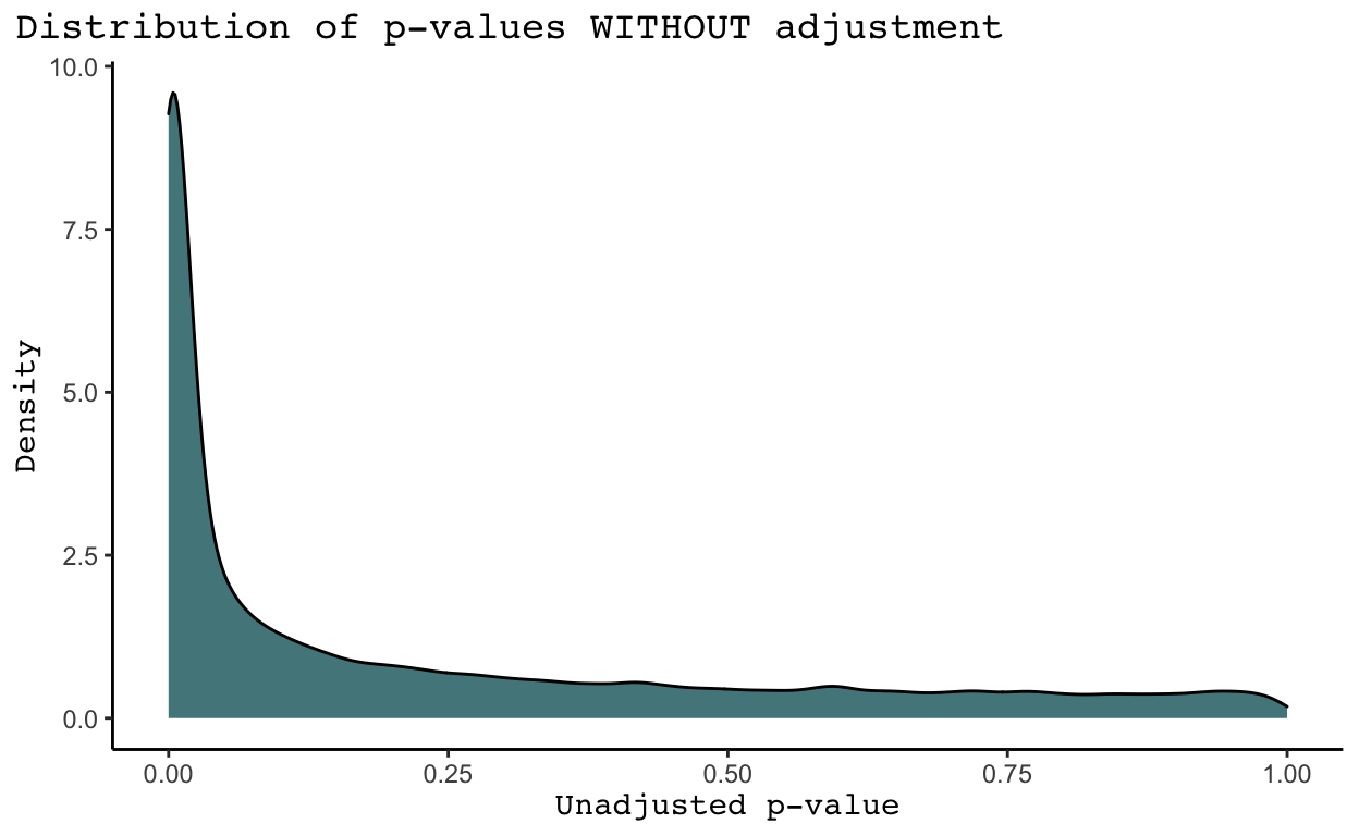
ggplot(rbloggersSep_adjusted, aes(x=GC))+
  geom_density(fill = "cadetblue4")+
  theme_classic()+
  labs(title = "Distribution of p-values WITH adjustment", x = "Adjusted p-value", y = "Density")+
  theme(plot.title.position = "plot",
        plot.title = element_text(family = "mono"),
        axis.title = element_text(family = "mono"))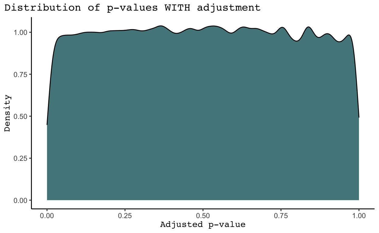
We see that in general SNPs tend to have much more significant p-values in the density plots WITHOUT adjustments than in the density plot WITH adjustments. Why is this the case? As discussed in the Introduction of The Power of Genomic Control, the adjusted p-values listed under the GC column account for nonindependence in a case-control sample caused by population stratification and cryptic relatedness (Bacanu, Devlin, and Roeder 2008). Population stratification means systematic ancestry differences between cases and controls. While we do not know the cases and controls in this analysis given the provided trait was all missing values, it is highly likely population stratification exists. Cryptic relatedness means sample structure in our data due to distant relatedness among samples with no known family relationships. We may also have family structure in our data, meaning sample structure due to familial relatedness among samples (Price et al. 2010). I believe there are ways to identify and remove related samples in the data, but I have not yet learned how to do this. Nonetheless, it is clear some combination of population structure, cryptic relatedness, and family structure has significantly inflated the p-values received from each test for significance between a SNP and our trait of interest. As a result, we will proceed with the adjusted p-values in the GC column.
With these p-values, we can create a Manhattan plot in a similar manner that we did earlier, just first adding SNP position data to our GWAS results.
rbloggersSep_adjusted <- rbloggersSep_adjusted%>%
  mutate(CHR = as.integer(CHR)) %>%
  left_join(rbloggers_map %>%
              dplyr::select(snp.name, position, chromosome), by = c("SNP" = "snp.name", "CHR" = "chromosome"))
rbloggersSep_adjusted %>%
mutate(minuslogp = -log10(GC),
CHR = as.factor(CHR)) %>%
ggplot(aes(x = CHR, y = minuslogp, group = interaction(CHR, position), color = CHR)) +
geom_point(position = position_dodge(0.8)) +
labs(x = 'chromosome', y = expression(paste('-log'[10],'(p-value)')))+
theme_classic()+
scale_color_manual(values=natparks.pals("DeathValley",24))+
theme(legend.position = "none")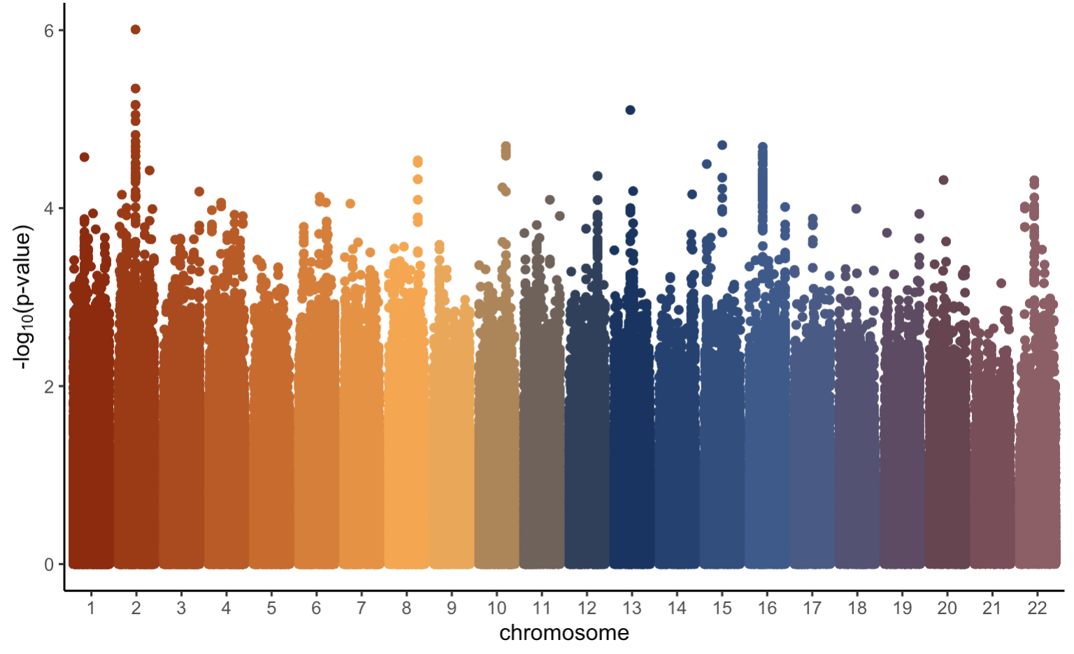
Overall, this manhattan plot looks fairly similar to the original one we created earlier. However, the most significant p-value in this plot has a \(-\text{log}_{10}(\text{p-value})\) of only about 6. This is expected given we did not simulate the trait based on any one particular SNP and we know that none of the SNPs are causally located with our trait of interest. As previously mentioned, in a real genetic study we do not know whether or not any of our SNPs will be causally associated with our trait of interest. Therefore, we need some kind of threshold to determine what SNPs we should look more closely at (if any). To learn more about how to do this, click on the Multiple Testing tab!